どうも、ちょげ(@chogetarou)です。
Pythonのmatplotlibでグラフの軸ラベルを設定する方法を紹介します。
方法

Pythonのmatplotlibでグラフの軸ラベルを設定するには、pyplotの次の2つのメソッドを使います。
- plt.xlabel():引数に指定した文字列をx軸のラベルに設定
- plt.ylabel():引数に指定した文字列をy軸のラベルに設定
まず、matplotlib.pyplotをインポートします。
import matplotlib.pyplot as pltpyplotからxlabel()とylabel()を呼び出します。
xlabel()の引数にx軸のラベルの文字列、ylabel()の引数にy軸のラベルの文字列を指定します。
plt.xlabel('x') #x軸のラベル
plt.ylabel('y') #y軸のラベル
xlabel()の引数に指定した文字列がx軸、ylabel()の引数に指定した文字列がy軸に設定されます。
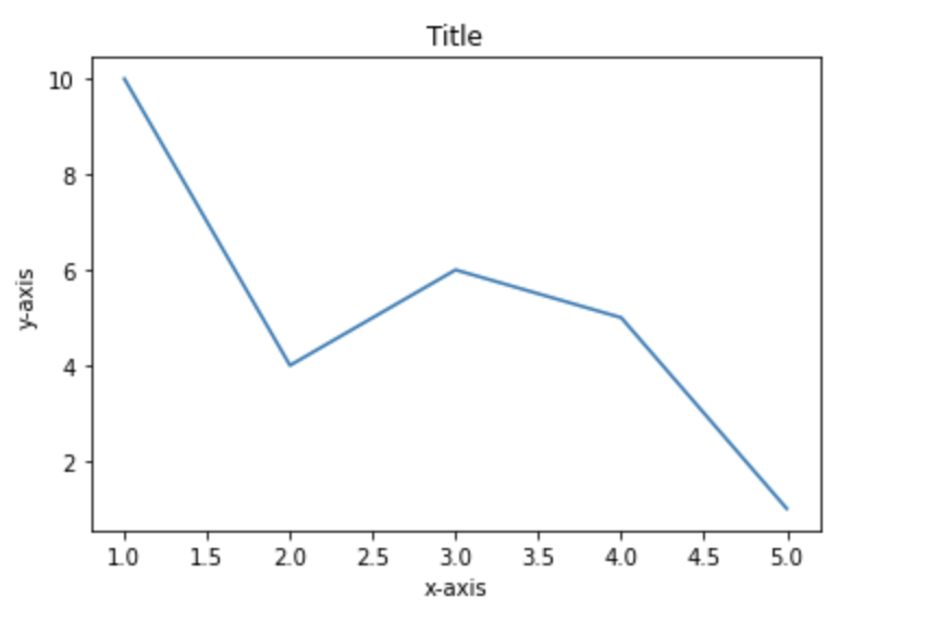
使用例
import matplotlib.pyplot as plt

x = [1, 2, 3, 4, 5]
y = [10, 4, 6, 5, 1]

plt.plot(x, y)

plt.title('Title')

plt.xlabel('x-axis')

plt.ylabel('y-axis')

plt.show()