
どうも、ちょげ(@chogetarou)です。
Rowのサイズを画面サイズとの比率で指定する方法を紹介します。
方法

Rowのサイズを画面サイズとの比率で指定するには、MediaQuery.of(context).sizeを使います。
まず、RowをSizedBoxもしくはContainerのchildに指定します。
そして、SizedBoxもしくはContainerの引数「height」に、高さとしてMediaQuery.of(context).size.heightに比率を掛けた値を指定します。
また、引数「width」に、横幅としてMediaQuery.of(context).size.widthに比率を掛けた値を指定します。
SizedBox(
  height: MediaQuery.of(context).size.height * (比率), //高さ
  width: MediaQuery.of(context).size.width * (比率), //横幅
  child: Row(
    children: [
      ・・・
    ],
  ),
),
MediaQuery.of(context).sizeを使えば、Rowのサイズを画面サイズとの比率で設定することが出来ます。
使用例
以下は、使用例です。
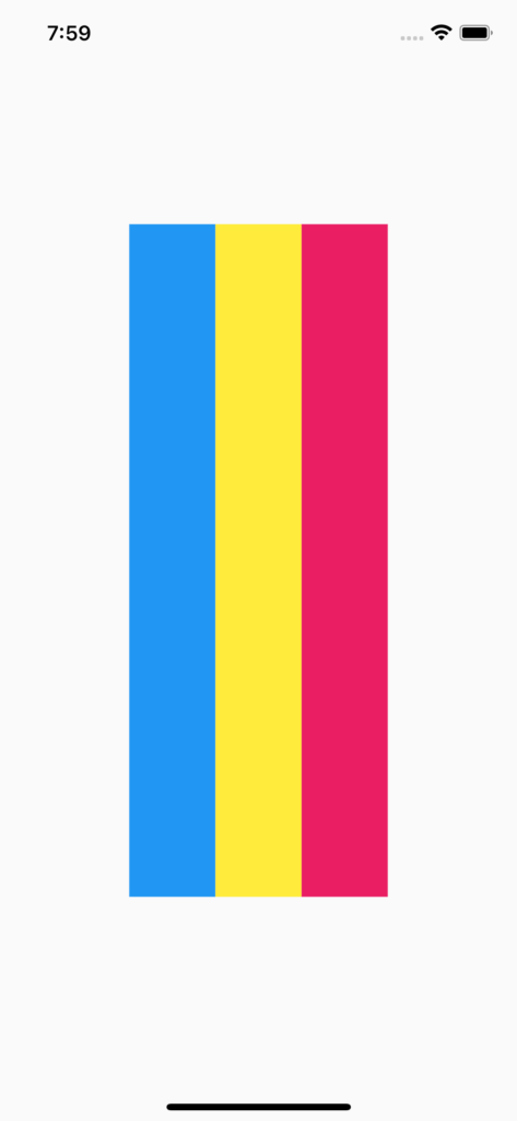
  @override
  Widget build(BuildContext context) {
    final _screenSize = MediaQuery.of(context).size;
    return Scaffold(
      body: Center(
        child: SizedBox(
          height: _screenSize.height * 0.6, //6割
          width: _screenSize.width * 0.5, //5割
          child: Row(
            children: [
              Expanded(
                child: Container(
                  color: Colors.blue,
                ),
              ),
              Expanded(
                child: Container(
                  color: Colors.yellow,
                ),
              ),
              Expanded(
                child: Container(
                  color: Colors.pink,
                ),
              ),
            ],
          ),
        ),
      ),
    );
  }