どうも、ちょげ(@chogetarou)です。
「Dividerウェジェット」の使い方を解説します。
使い方
Dividerウェジェットは、横の区切り線を表示したい場所に配置するだけで、簡単に使うことが出来ます。
設定

区切り線の見た目や高さなどの設定は、次のような引数を使って行います。
- color : 色
- thickness : 太さ
- height : 高さ
- indent : 左の余白
- endIndent : 右の余白
「height」引数は、ウェジェット自体の高さを設定する引数です。
「indent」と「endIndent」は、左右の余白、言い換えると区切り線をどれだけ短くするかを設定します。
使用例
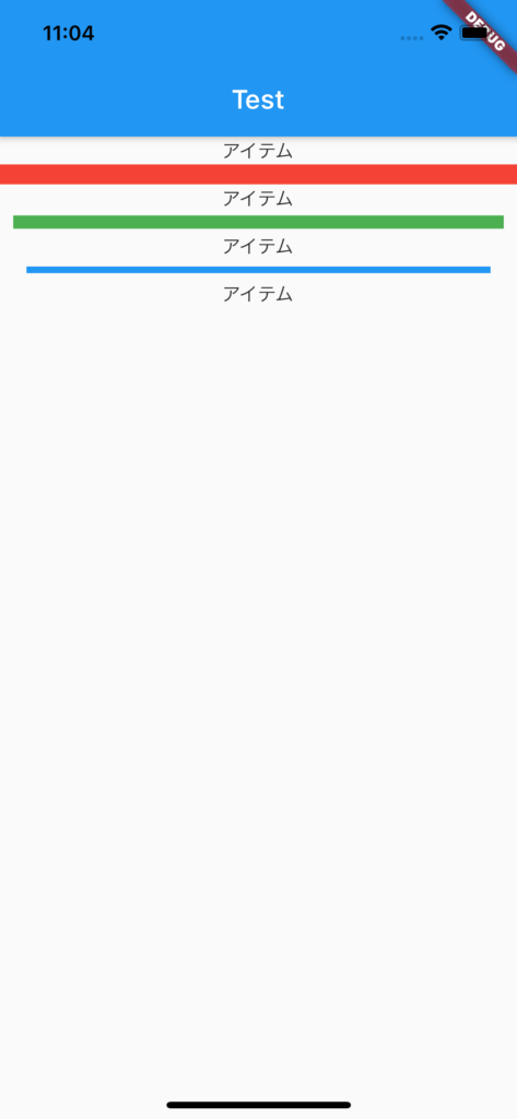
 @override
  Widget build(BuildContext context) {
    return Scaffold(
      body: Column(
        children: [
          Text("アイテム"),
          Divider(
            color: Colors.red,
            thickness: 15.0,
            height: 15.0,
          ),
          Text("アイテム"),
          Divider(
            color: Colors.green,
            thickness: 10,
            height: 15,
            indent: 10,
            endIndent: 10,
          ),
          Text("アイテム"),
          Divider(
            color: Colors.blue,
            thickness: 5,
            height: 15,
            indent: 20,
            endIndent: 20,
          ),
          Text("アイテム"),
        ],
      ),
    );
  }
縦の区切り線
「Dividerウェジェット」は、横の区切り線で、Rowウェジェットや横向きのListViewなどでは、機能しません。
また、Dividerウェジェットには、縦向きに切り替えるといった引数はありません。
なので、縦の区切り線を使いたい場合は、「VerticalDividerウェジェット」を使います。

Divider class - material library - Dart API
API docs for the Divider class from the material library, for the Dart programming language.
api.flutter.dev

VerticalDivider class - material library - Dart API
API docs for the VerticalDivider class from the material library, for the Dart programming language.
api.flutter.dev