
どうも、ちょげ(@chogetarou)です。
Rowの横幅を画面サイズとの比率で指定する方法を紹介します。
方法

Rowの横幅を画面サイズとの比率で指定するには、MediaQuery.of(context).size.widthを使います。
まず、RowをSizedBoxもしくはContainerのchildに指定します。
そして、SizedBoxもしくはContainerの引数「width」に、MediaQuery.of(context).size.widthに比率を掛けた値を指定します。
SizedBox( //Containerでも可
  width: MediaQuery.of(context).size.width * (比率),
  child: Row(
    children: [
      ・・・
    ],
  ),
),
MediaQuery.of(context).size.widthを使えば、Rowの横幅を画面サイズとの比率で設定することが出来ます。
使用例
以下は、使用例です。
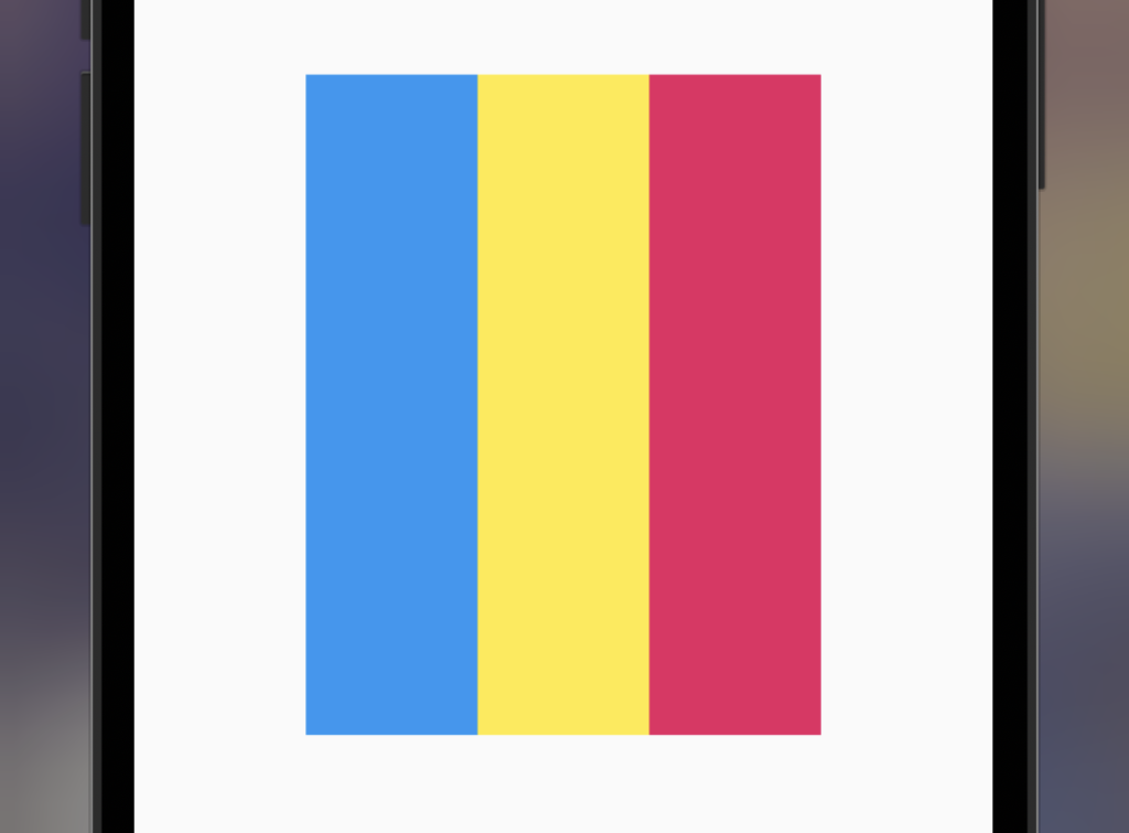
  @override
  Widget build(BuildContext context) {
    return Scaffold(
      body: Center(
        child: SizedBox(
          width: MediaQuery.of(context).size.width * 0.6, //60%
          height: 300,
          child: Row(
            children: [
              Expanded(
                child: Container(
                  color: Colors.blue,
                ),
              ),
              Expanded(
                child: Container(
                  color: Colors.yellow,
                ),
              ),
              Expanded(
                child: Container(
                  color: Colors.pink,
                ),
              ),
            ],
          ),
        ),
      ),
    );
  }
[Flutter]Rowの要素を上に寄せるには?
Rowの要素を上に寄せる方法を紹介します。
www.choge-blog.com
2021.12.30

[Flutter]Rowの高さを設定するには?
Rowの高さを設定する方法を紹介します。
www.choge-blog.com
2021.12.30

[Flutter]Rowのパディングを設定するには?
Rowのパディングを設定する方法を紹介します。
www.choge-blog.com
2021.12.30

[Flutter]Rowの要素を右寄せにするには?
Row内のウェジェットを右に寄せて配置する方法を紹介します。
www.choge-blog.com
2021.12.29